Mostrando entradas con la etiqueta R. Mostrar todas las entradas

sábado, 26 de noviembre de 2022

Getting coordinates (lon,lat) from road name and kilometer in Spain


 Hi there!

 Early this year we published a research about getting animal abundance estimates from wildlife - vehicles collisions in Ecography journal:

Can we model distribution of population abundance from wildlife–vehicles collision data?


The first thing we had to deal with was to obtain geographical coordinates (latitude and longitude) from a database with the name of the roads and the kilometer point. At the end, I wrote a small chunk of code to do that by using the Transport Network from the Spanish Geographic Institute. I first downloaded all the kilometer point datasets (by provinces) and I merged them all in a single file. You can find this file here (but it's old and current datasets should be updated, so I recommend you to download it again from the original sources). Then I used R language to create a routine to "search" the coordinates that better matched my points.

I recently updated my code, warping it in a function and I created a toy-dataset with 5 points to show you how it works (see below, comments in Spanish).


 library(dplyr)  
 library(RCurl)  
   
 # Guardamos las URLs de los datos almacenados en mi Github (https://github.com/jabiologo/)  
 roadData <- "https://github.com/jabiologo/roads/blob/main/roadData.RData?raw=true"  
   
 # Cargamos la base de datos del IGM con los puntos kilométricos  
 # Cargamos la base de datos con nuestros nombres de carreteras y kilómetros  
 load(url(roadData))  
   
 # Base de datos del IGN  
 head(km)  
 # Mis puntos para los cuales quier las coordenadas  
 # Nótese que si se quieren utilizar unos datos propios con este script,  
 # estos deben tener el mismo formato que el objeto "puntos"  
 head(puntos)


 # Cargamos la función  
 pkm2xy <- function(events, database){  
  # Almacenaremos todas las carreteras que no se encuentren en nuestra base de datos  
  noMatch <- events[!(events[,1] %in% database$Nombre),]  
  # Filtramos nuestros datos  
  events <- events[events[,1] %in% database$Nombre,]  
  # Creamos una serie de columas para almacenar las coordenadas y otra info  
  events$X <- NA  
  events$Y <- NA  
  events$error <- NA  
  events$RoadAssigned <- NA  
  events$PkmAssigned <- NA  
  # Mediante un bucle iremos obteniendo nuestras coordenadas  
  for(i in 1:nrow(events)){  
   # Seleccionamos de nuestra base de datos aquel punto kilométrico que se  
   # encuentre más cerca de nuestro kilómetro  
   sel <- database %>% filter(Nombre == events[i,1]) %>%   
    filter(abs(numero - events[i,2]) == min(abs(numero - events[i,2])))  
   # Almacenamos las coordenadas  
   events[i,3:4] <- sel[1,1:2]  
   # Calculamos el error entre el punto kilométrico obtenido y el deseado  
   events[i,5] <- abs(sel$numero[1] - events[i,2])  
   # Almacenamos el nombre de la carretera y el punto kilométrico que hemos   
   # seleccionado en nuestra base de datos del IGN   
   events[i,6] <- sel$Nombre[1]  
   events[i,7] <- sel$numero[1]  
   print(i)  
  }  
  # Retornamos una lista con dos elementos:  
  # Aquellos puntos para los cuales se han conseguido las coordenadas  
  # Aquellos puntos para los que no se ha encontrado la carretera  
  return(list(events,noMatch))  
 }  
   
 # Corremos nuestra función con el fichero de ejemplo  
 pkm2xy(puntos,km)  
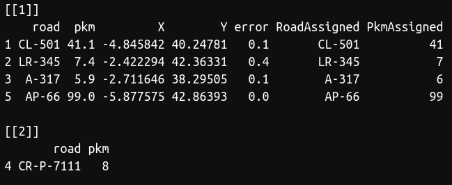


As you can see, there was a road (CR-P-7111) that was not present in our database, so we couldn't find the coordinates for this point. However, we obtained the coordinates for the rest points. The function also show you the error in kilometers between the point and the latitude/longitude obtained. I recommend to perform a random test to visually check that everything was right, that is, if your dataset is large, select a number of points and manually check with Google Maps or similar if the function worked well.

You can find the code and the data also in my GitHub repository.


Hope it's useful! 

 Best

 References

Fernández‐López, J., Blanco‐Aguiar, J. A., Vicente, J., & Acevedo, P. (2022). Can we model distribution of population abundance from wildlife–vehicles collision data?. Ecography, 2022(5), e06113.


lunes, 28 de junio de 2021

Missing Migrants, tracking human deaths along migratory routes

 Hi there,

Several years ago I received the book “Como si nunca hubieran sido” as a Christmas present. In this poem, Javier Gallego and Juan Gallego talk about the real drama suffered by immigrants trying to reach Europe through the Mediterranean route. The current pandemic situation has overshadowed many problems that affect millions of people each year. Missing Migrants Project tracks incidents involving migrants, including refugees and asylum-seekers, who have died or gone missing in the process of migration towards an international destination. It shows the situation of many people who are forced to emigrate even during the pandemic time. And it also helps me to contextualize my first world problems. 


Here you have a simple analyses about the human migration fatalities during the last years in the Mediterranean corridor using R. 


 library(dplyr)  
 library(lubridate)  
 library(purrr)  
 library(incidence)  
 library(ggmap)  
 library(scales)  
   
 # Let's download and read the data from the Missing Migrants Project web site  
 url <- "https://missingmigrants.iom.int/global-figures/all/csv"  
 mm <- read.csv("/home/javifl/Descargas/MissingMigrants-Global-2021-06-27T21-15-07.csv")  
   
 # Filter the data for Mediterranean region  
 mm <- mm %>% filter(Region == "Mediterranean") %>% filter(Migration.Route != "")  
 mm$lon <- as.numeric(unlist(map(strsplit(mm$Location.Coordinates, ", "), 2)))  
 mm$lat <- as.numeric(unlist(map(strsplit(mm$Location.Coordinates, ", "), 1)))  
 mm$date <- mdy(mm$Reported.Date)  
   
 # plot the incidence of fatalities  
 mmInc <- incidence(mm$date, interval = 30, groups = mm$Migration.Route)  
 plot(mmInc, labels_week = F, stack = TRUE, border = "grey") + 
      scale_x_date(labels = date_format("%B %Y"))  


We can plot the monthly incidence of accidents involving migrants using the R package incidence. Here you can see how during the first months of 2020 the migration fatalities decreased, probably due to the pandemic impact. However, human migration incidents increased during the second half of 2020 despite of pandemic restrictions in West and Central Mediterranean routes.


Finally, we can plot monthly incidents using ggmap R package.

 months <- seq(ymd("2014-01-1"),ymd(max(mm$date)), by = '1 month')  
 myLocation<-c(min(mm$lon)-2.5, min(mm$lat)-2, max(mm$lon)+1, max(mm$lat)+1)  
 myMap<-get_map(location=myLocation, source="stamen", maptype="watercolor", crop=FALSE)  
   
 for (i in 1:length(months)-1){  
  int <- interval(months[i], months[i+1])  
  newmm <- mm[mm$date %within% int,]  
  id <- sprintf("%02d", i)  
  if (nrow(newmm) > 0){  
   png(paste("mm",id,".png", sep=""), width=900, height=610, units="px",    
     pointsize=18)    
   print(ggmap(myMap) +   
       geom_point(aes(x=lon, y=lat, size = 2), data=newmm, col="orange", alpha=0.5) +  
       #geom_density2d(aes(x=lon, y=lat), data=newmm, size = 0.3) +   
       #stat_density2d(data = newmm,  
       #        aes(x = lon, y = lat, fill = ..level.., alpha = ..level..), size = 0.01,  
       #        bins = 16, geom = "polygon") + scale_fill_gradient(low = "green", high = "red") +  
       scale_alpha(range = c(0, 0.2), guide = FALSE) +  
       theme(legend.position = "none", plot.title = element_text(size = 25)) +  
       ggtitle(paste(year(months[i]), month(months[i], label = T, abbr = F), sep=" - ")))  
   dev.off()  
    }  
  print(id)  
 }  


Stay safe!

"No soy un número ni parte de una cifra 

aunque se paga por igual la misma tarifa..."


viernes, 22 de enero de 2021

Are betting houses randomly distributed in Madrid? Point pattern analysis in R

Hi there!

  Last December 13th there was a demonstration in Carabanchel, my home neighborhood in Madrid (Spain) against the proliferation of betting houses (small casinos where you can get cheap drinks or coffees while you spend your money betting or gambling). Many neighborhood associations usually complain against this kind of places arguing they bait young people with very low prices, who can develop gambling addiction in the future. Moreover some organizations ensure that the proliferation of this kind of places is focused in working class neighborhoods with low incomes and high unemployed rates (see this great report for more information about that - in Spanish). So, how could we know if betting houses are randomly distributed in Madrid?

  Imagine that you have a 25x25 (625 cells) square grid and you want to scatter 2500 points. If the points are randomly distributed, they will have the same probability of occupy whatever cell. That is, the first point will have a probability of 1/625 of being in cell number 1, the same probability (1/625) probability of being at cell number 2, and so on. Thus, if we have 2500 points in 625 cells, each cell would have 2500/625 = 4 points in average. This is the meaning of the lambda from a Poisson distribution, the mean or the most probable value.

  Imagine now that we have the same points in the same grid, but now they are clustered in 3 groups. In this dummy example, we can easily guess that they are not randomly distributed by just observing the point pattern. But how could we demonstrate mathematically/numerically they are not randomly distributed?

  Well, given we know the shape of the histogram (distribution) that should have a completely random distribution (in our case a Poisson(λ=4)), an easy and straightforward way to demonstrate mathematically that the second point patter is not random at all would be to compare both distributions using for example a Kolmogorov–Smirnov test in R.

  Lets do the same with betting houses in Madrid city (Spain). Betting places locations can be downloaded from the city government website, as well as other data such as neighborhood limits or family income per neighborhood.I prepared a .zip with the needed files which can be downloaded from here.

There are currently 409 betting houses. We will divide the city in a grid of 18x18 cells of 1 km size as follows


 # Load required packages  
 library(rgdal)  
 library(raster)  
 library(dismo)  
 library(GISTools)  
   
 # Load data  
 nb <- readOGR("/home/javifl/gambling/SHP_ETRS89/barrios_income_pop.shp")  
 bh <- read.csv("/home/javifl/gambling/betting_house.csv")  
   
 # Create the grid  
 bh.sp <- SpatialPointsDataFrame(coords=bh[,1:2], data=bh)  
 ext <- extent(c(min(bh$x),min(bh$x)+18000,min(bh$y),min(bh$y)+18000))  
 landscape <- raster(ncols=18,nrows=18,ext=ext, vals=1:324)  
 grid <- rasterToPolygons(landscape)  
   
 # Plot betting houses in Madrid  
 par(mar=c(0.1,0.1,1,0.1))  
 plot(nb, main = "City of Madrid")  
 plot(grid, lwd = 0.4, add = TRUE)  
 points(bh.sp, pch=16, cex=0.7, col="black")  


 Cool. Since Madrid is an heterogeneous city, we will select for our analysis only those cells in which there is one or more betting houses. Then, we'll spread random points in the selected squares to compare both histograms/distributions: random points VS betting houses.

 # Select cells with betting houses  
 grid$bh <- poly.counts(bh.sp, grid)  
 sel.sqr <- (grid[grid$bh > 0,])  
 landscape[grid$bh == 0] <- NA  
   
 # Plot  
 par(mar=c(0.1,0.1,0.1,0.1))  
 plot(sel.sqr)  
 lines(nb, lwd = 0.2)  
 points(bh.sp, pch=16, cex=0.7, col="black")  
   
 # Add random points in selected cells  
 rp <- randomPoints(disaggregate(landscape, 100), nrow(bh))  
 points(rp, pch=16, cex=0.7, col = "red" )  
 rp.sp <- SpatialPointsDataFrame(coords=rp[,1:2], data=data.frame(rp))  


 Well done! We have selected 118 cells with at least one betting house and we have scattered 409 random points on them. So, now the last task is to count the number of betting houses and the number of random points at each cell. Then, we could compare both histograms/ distributions, and decide if they present a similar pattern.

 par(mfrow = c(1,2))  
 hist(poly.counts(rp.sp, sel.sqr), right=F, main = "random points",   
 xlab="number of random points by cell")  
 hist(poly.counts(bh.sp, sel.sqr), right=F, main = "betting houses",   
 xlab="number of betting houses by cell")  


As you can see, under a random point pattern the most frequent value is between 3 and 4. Since we have 409 points randomly distributed over 108 cells, we expected to have 409/108 = 3.78 points at each cell. It looks pretty good!

However, we can see that the most frequent value in the betting house histogram is between 0 and 2... This is because there are many empty cells, while there are some of them with high number of betting houses (a clustered pattern). We could compare both distributions mathematically using a Kolmogorov–Smirnov test.

 #Kolmogorov–Smirnov test  
 ks.test(poly.counts(rp.sp, sel.sqr), poly.counts(bh.sp, sel.sqr))  


Bonus Track: so, what variable or variables drive the distribution of betting houses in Madrid? Here you have a clue... but take the data and explore it yourself!


Stay safe!


jueves, 9 de julio de 2020

N-mixture models to estimate animal abundance with R and unmarked


Hi there!

 During the pandemic lockdown I was studying how N-mixture models to estimate animal abundance works. As a result, I wrote this small tutorial in R (Spanish) that helped me to better understand such models. Any correction or suggestion can be made by posting here or at jflopez.bio@gmail.com.

Hope you enjoy it!


viernes, 3 de abril de 2020

Another "flatten the COVID-19 curve" simulation... in R


 Hi there,

This is the best meme I've found during these days...


Well, here it is my "BUT" contribution. Some weeks ago The Washington Post published this simulations about how "social distancing" could help to "flat the curve" of COVID-19 infections. I fell in love with these simulations because their simplicity and explanatory power. Indeed, you can use the pretty similar principles to simulate predator hunt behavior and other movement patterns... I wrote some R code to have a tiny version of them...


 library(raster)  
 library(dismo)  
   
 r <- raster(nrows = 100, ncols = 100, xmn = 0, xmx = 100, ymn = 0, ymx = 100)   
 r[] <- 0  
   
 steps <- 500  
 n <- 100  
   
 locations <- data.frame(matrix(ncol = n, nrow = steps))  
   
 pp <- randomPoints(r,n)  
 cell <- cellFromXY(r, pp)  
 infected <- 1:10  
 pob <- 1:n  
 ratio <- data.frame(1:steps, NA)  
 pob_inf <- list()  
   
 for (j in 1:steps){  
  print(j)  
  locations[j,] <- cell  
    
  for(i in 1:n){  
     
   cell[i] <- adjacent(r, cell[i], 8)[round(runif(1,0.51,nrow(adjacent(r, cell[i], 8))+0.49),0),2]  
     
  }  
    
  new_inf <- cell %in% cell[infected]  
  infected <- pob[new_inf]  
  ratio[j,2] <- length(infected)  
  pob_inf[[j]] <- infected  
   
 }  
   
 locations2 <- data.frame(matrix(ncol = n, nrow = steps))  
   
 cell2 <- cellFromXY(r, pp)  
 infected2 <- 1:10  
 pob2 <- 1:n  
 ratio2 <- data.frame(1:steps, NA)  
 pob_inf2 <- list()  
   
 for (j in 1:steps){  
  print(j)  
  locations2[j,] <- cell2  
    
  for(i in 1:25){  
     
   cell2[i] <- adjacent(r, cell2[i], 8)[round(runif(1,0.51,nrow(adjacent(r, cell2[i], 8))+0.49),0),2]  
     
  }  
    
  new_inf2 <- cell2 %in% cell2[infected2]  
  infected2 <- pob2[new_inf2]  
  ratio2[j,2] <- length(infected2)  
  pob_inf2[[j]] <- infected2  
   
 }  

Let's make some plots to put them together in a GIF and better visualize the results...


 num <- seq(1,500,4)  
   
 for (p in 1:125){  
  id <- sprintf("%03d", num[p])  
  png(paste("corona_",id,".png", sep=""), width=780, height=800, units="px", pointsize = 15)  
  layout(matrix(c(1,1,2,3),2,2,byrow = TRUE))  
  plot(ratio[1:num[p],],pch=19, xlim = c(0,500), ylim = c(0,100), ylab = "nº of infected",   
     xlab = "time", col = "red", cex.axis = 1.4, cex.lab = 1.4, main = "Infected curves", cex.main = 2)  
  points(ratio2[1:num[p],],pch=19,col="blue")  
  legend("topright", legend = c("free movement", "restricted movement"),lwd = c(4,4), col = c("red","blue"), cex = 1.5 )  
  plot(r, col = "white", legend = FALSE, axes = FALSE, main = "free movement", cex.main = 1.8)  
  points(xyFromCell(r,as.numeric(locations[num[p],])), cex = 1.2, col = "grey40", pch = 18)  
  points(xyFromCell(r,as.numeric(locations[num[p],]))[pob_inf[[num[p]]],], pch = 18, col = "red", cex = 1.4)  
  plot(r, col = "white", legend = FALSE, axes = FALSE, main = "restricted movement", cex.main = 1.8)  
  points(xyFromCell(r,as.numeric(locations2[num[p],])), cex = 1.2, col = "grey40", pch = 18)  
  points(xyFromCell(r,as.numeric(locations2[num[p],]))[pob_inf2[[num[p]]],], pch = 18, col = "blue", cex = 1.4)  
    
  dev.off()   
 }  


Done!


 Stay safe!


domingo, 25 de noviembre de 2018

Plotting wind highways using rWind


Hi there!

Our manuscript about rWind R package has been recently accepted for publication in Ecography! As you know, rWind is a tool used to download and manage wind data, with some utilities that make easy to include wind information in ecological or evolutionary analyses (or others!).

Though there are several examples in the Supporting material of the publication, and others in the vignette included in the CRAN version, here you have a full tutorial with the main utilities of rWind... enjoy!

Computing wind connectivity of Azores Archipelago


In this example, we will compute wind connectivity of Azores Islands with different points of Europe, Africa and North America during June 2018. I will divide each task of this tutorial in different sections for clarification.


Downloading wind time series using lubridate and wind.dl_2()


In the last version of rWind (1.0.4), we can use lubridate to create a list of dates which will be used latter with wind.dl_2 to download wind time series. The object obtained with wind.dl_2 is an "rWind_series" "list". This object can be easily used with other rWind functions as we'll see later.

 # Make sure that you have the last version of rWind  
   
 devtools::install_github("jabiologo/rWind")  
 library(rWind)  
 library(lubridate)  
   
 # Here, we use ymd_hms from lubridate package to create a sequence of dates  
   
 dt <- seq(ymd_hms(paste(2018,6,1,12,00,00, sep="-")),  
      ymd_hms(paste(2018,6,30,12,00,00, sep="-")),by="1 days")  
   
 # Now we can use wind.dl_2 with this sequence of dates. Have into account  
 # that it could take a while, they are 30 datasets and it's a big area.   
   
 ww <- wind.dl_2(dt,-85,5,20,60)  


Obtaining maximum wind speed during the time series with dplyr


We can use the rWind function called "tidy" to play with the "rWind_series" "list" object to obtain, for example, the maximum speed reported for each cell in the study area during the time series.

 # After tidy our wind data, we can use dplyr utilities to easily  
 # obtain several metrics from our wind data. Notice that wind average  
 # is a special case, and it will be discussed later  
   
 t_ww <- tidy(ww)  
   
 library(dplyr)  
 g_ww <- t_ww %>% group_by(lat, lon)  
   
 # Now, we select only the maximum speed values for each coordinate  
   
 max_ww <- g_ww %>% summarise(speed = max(speed))  
 maxw <- cbind(max_ww$lon, max_ww$lat, max_ww$speed)  
 head(maxw)  
   
 # We can also check the maximum speed value in the whole study area   
   
 max(maxw[,3])  
   
 # Finally, we can transform this data into a raster layer  
   
 rmax <- rasterFromXYZ(maxw)  
 acol <- colorRampPalette(c("white", "blue", "darkblue"))  
 plot(rmax, col=acol(1000), main= "Maximum wind speed reported",  
     xlab="Longitude", ylab="Lattitude")  
   
 library(rworldmap)  
 lines(getMap(resolution = "high"), lwd=2)  


Computing averages of wind speeds and directions


Since wind data is a vectorial magnitude given in two components (U and V), to compute speed and direction averages we should use both vectors. To make it easier, rWind includes wind.mean function. Notice that wind.mean is specially developed to work with wind.dl_2 outputs, so it will require "rWind_series" object as input.
 # We can easily use wind.mean() function  
   
 w_mean <- wind.mean(ww)  
   
 # And then use wind2raster directly to create a raster layer  
   
 r_mean <- wind2raster(w_mean)  

 # We can plot a subset of this raster around Azores Islands.  
 # Using "arrowDir" we can include arrows for wind direction with   
 # "Arrowhead" function from "shape" R package  
   
 plot(r_mean$wind.speed, main= "Wind speed and direction average",
      col=acol(1000), xlim=c(-38,-18), ylim=c(33,43))  
 alpha <- arrowDir(w_mean)  
 library(shape)  
 Arrowhead(w_mean$lon, w_mean$lat, angle=alpha,   
      arr.length = 0.2, arr.type="curved")  
 lines(getMap(resolution = "low"), lwd=4)  


Wind connectivity between Azores and mainland


To complete this tutorial, we will use the downloaded wind data to compute wind connectivity between several points in mainland and Azores Archipelago. This kind of measures can be useful in order to establish theories about island colonization by plants or other organisms that could be influenced by wind currents. We will also use this connectivity to compute least cost paths between two locations, in order to virtually plot a wind highway connecting mainland with Azores islands.

 # First, we define our locations. 7 locations in the East   
 # and 7 in the West. The last one is a point in the Azores islands  
   
 loc <- matrix(c(-7, -4, -1, -9, -6,-10,-15,   
         -60, -56,-63,-76,-76,-81,-80, -27,  
         55, 50, 45, 40, 35, 30, 25,   
         55, 50, 45, 40, 35, 30, 25, 39), 15, 2)  
   
 colnames(loc) <- c("lon", "lat")  
 rownames(loc) <- c(seq(1,14,1), "Azores")  
   
 # Check how "loc" is looking   
   
 tail(loc)  
   
 # You can plot them  
 #plot(r_mean$wind.speed, col=acol(1000))  
 #lines(getMap(resolution = "low"), lwd=2)  
 #points(loc, col="red4", pch = 19, cex = 2)  


Now, we'll execute the next tasks:
  1. We'll use wind2raster to obtain raster layers of wind direction and speed of each day in the time series.
  2. Then, for each day, we'll compute the conductance matrix, a matrix with connectivity values between every single cell of the entire study area.
  3. Later, with each conductance matrix, we'll compute the cost between our locations and will store them in a cost_list object.
  4. Finally, for each day, if the Cost is not Infinite, we'll get the shortest path between two selected locations, and we'll store it into a “paths” object.

 # 1) Raster layers from wind time series  
   
 layers <- wind2raster(ww)  
   
 # 2) Conductance from wind direction and speed  
   
 Conductance <- flow.dispersion(layers, type="passive",  
                 output="transitionLayer")  
   
 # 3) and 4) Using a loop to compute cost between  
 # locations and least cost paths between location 11  
 # and Azores islands (as an example).  
   
 cost_list <- array(NA_real_, dim=c(15,15,30))  
 paths <- list(1:30)  
   
 library(gdistance)  
   
 for (i in 1:30){  
  cost_list[,,i] <- costDistance(Conductance[[i]],loc)  
  if (costDistance(Conductance[[i]],loc[11,] , loc[15,]) != Inf){  
   paths[[i]] <- shortestPath(Conductance[[i]], loc[11,], loc[15,],  
                 output="SpatialLines")  
   print(i)  
  }  
 }


Now, we will manage a little bit the results to plot them in a cool way.


 # Transform costs in connectivity  
   
 connectivity <- 1/cost_list  
   
 # Obtain connectivity averages  
   
 conn_avg <- apply(connectivity, c(1, 2), mean, na.rm = TRUE)  
   
 # Here we filter only connectivity from mainland to Azores  
 # As connectivity has arbitrary magnitude and units, we will   
 # multiply connectivity values 1000 times to avoid decimal zeros.  
   
 conn_azores <- conn_avg[,15]  
 conn_azores <- conn_azores *1000  
   
 # Finally, we can plot connectivity values relative to the width  
 # of the connections between mainland and Azores. You can power  
 # the values to increase the differences between them.  
   
 plot(r_mean$wind.speed, main= "Connectivity from mainland to Azores",
     col=acol(1000))  
 lines(getMap(resolution = "low"), lwd=1)  
 for (i in 1:14){  
  lines(rbind(loc[i,], loc[15,]), lwd = conn_azores[i]^3, col="red4")  
 }  
 points(loc, col="red", pch = 19, cex = 1.5)  
 text( loc+2, labels=c(round(conn_azores[1:14], 2),"Azores"),  
    col="white", cex= 1.5, font=2)  

Last but not least, we can use the shortest paths stored for each day to plot a density heatmap. This can help us to visualize wind corridors across our study area (our wind highways!).

 # We'll use spatstat library to convert the shortest  
 # paths lines into an psp object.  
   
 library(spatstat)  
   
 paths_clean <- paths[!sapply(paths, is.null)]  
 paths_merged <- paths_clean[[1]]  
 for (h in 2:length(paths_clean)) {  
  paths_merged <- rbind(paths_merged,paths_clean[[h]])  
 }  
 paths_psp <- as(paths_merged, "psp")  
   
 # Now, we can obtain a kernel density of the paths  
 # and convert it into a raster layer that can be plotted.  
 # You can play with sigma value to modify the smoothing.  
   
 lines_kernel <- density(paths_psp, sigma=1, dimyx=c(350,410))  
 kernel <- raster(lines_kernel)  
 #kernel[kernel<(maxValue(kernel)*0.1)]<-NA  
   
 ext <- extent(r_mean$wind.speed)  
 kernel <- extend(kernel, ext)  
 kernel[is.na(kernel)] <- minValue(kernel)  
   
 acol <- colorRampPalette(c("grey40","darkblue","red2",
                               "orange","yellow","white"))  
 plot(kernel, col=acol(1000), zlim=c(-0.01,5),  
       main = "Least cost paths density", xlab="Longitude",  
       ylab="Lattitude")  
 lines(getMap(resolution = "high"), lwd=2)


Isn't it cool?

 That's all for now!


miércoles, 4 de julio de 2018

New rWind release on CRAN! (v1.0.2)


Hi there!

Just a few lines to inform you about the new release of rWind R package (v1.0.2). This version have several new features. Here you have an example of one of them, the function wind.dl_2 to download time series of wind data. In this example we create a bunch of PNG files to be converted later into a GIF of wind speed of east Asia region.

Enjoy!


 # We will create a gif of wind speed for east Asia during the end of June (2018)  
   
 # First, we should load the packages that we will use. Use install.packages() to   
 # download and install the new version of rWind (v1.0.2)  
   
 install.package("rWind")  
   
 library(rWind)  
   
 library(fields)  
 library(shape)  
 library(rworldmap)  
 library(lubridate)  
   
 # Now, we use lubridate package to create a sequence of dates/times (each three  
 # hours)  
   
 dt <- seq(ymd_hms(paste(2018,6,25,00,00,00, sep="-")),  
      ymd_hms(paste(2018,7,4,21,00,00, sep="-")),by="3 hours")  
   
 # Now, we use the new function wind.dl_2 to download the whole time series of  
 # wind data. We use the "dt" object created with lubridate to provide the input   
 # to wind.dl_2. Since it's a large area and many days, it could take a while...  
   
 wind_series <- wind.dl_2(dt,90,150,5,40)  
   
 # Next, we can use wind2raster function from rWind package directly over the   
 # output from wind.dl_2, it has been adapted to work with this lists of wind  
 # data.  
   
 wind_series_layer <- wind2raster(wind_series)  
   
 # Finally, we will create a bunch of PNG files to be converted later in a GIF  
   
 id<-0  
 for (i in 1:72) {  
  id <- sprintf("%03d", i)  
  png(paste("asia",id,".png", sep=""), width=1000, height=600, units="px",  
    pointsize=18)  
  image.plot(wind_series_layer[[i]]$wind.speed, col=bpy.colors(1000),  
        zlim=c(0,18), main =wind_series[[i]]$time[1])  
  lines(getMap(resolution = "low"), lwd=3)  
  dev.off()  
 }  
   

domingo, 4 de diciembre de 2016

rWind R package released!

Hi there! 

 Let me introduce you rWind, an R package with several tools for downloading, editing and converting wind data from Global Forecast System (https://www.ncdc.noaa.gov/data-access/model-data/model-datasets/global-forcast-system-gfs) in other formats as raster for GIS! Wind data is a powerful source of information that could be used for many purposes in biology and other sciences: from the design of air pathways for airplanes to the study of the dispersion routes of plants or bird migrations. Making more accessible this kind of data to scientist and other users is the objective of ERDDAP (http://coastwatch.pfeg.noaa.gov/erddap/index.html), a web service to dive into a lot of weather and oceanographic data-bases and download it easily. 

 I was using specifically one of the ERDDAP data-bases to get wind direction and speed from satellite data, the NOAA/NCEP Global Forecast System (GFS) Atmospheric Model (http://oos.soest.hawaii.edu/erddap/info/NCEP_Global_Best/index.html). At first, I was following this wonderful post from Conor Delaney (http://www.digital-geography.com/cloud-gis-getting-weather-data/#.WERgamd1DCL) to download and fix the data to be used as a GIS layer. However, I needed soon to download and modify a lot of wind data, so I started to write some R functions to automate the different tasks. Finally, I decided to put all together into an R package and upload it to CRAN repository to make it available for other users that could be interested in this kind of data. Here I give you a reference manual and an R code with a brief tutorial to get familiar with the utilities of the rWind package!

If you have any doubt or you want to report a bug or make any suggestion, please, comment the post or write me: jflopez@rjb.csic.es or jflopez.bio@gmail.com. 

 Enjoy it!


Javier Fernández-López (2016). rWind: Download, Edit and Transform Wind Data from GFS. R package version 0.1.3. https://CRAN.R-project.org/package=rWind


 # Download and install "rWind" package from CRAN:  
 install.packages("rWind")  
 # You should install also "raster" package if you do not have it   
   
 library(rWind)  
 library(raster)  
   
 packageDescription("rWind")  
 help(package="rWind")  
   
 # "rWind" is a package with several tools for downloading, editing and transforming wind data from Global Forecast   
 # System (GFS, see <https://www.ncdc.noaa.gov/data-access/model-data/model-datasets/global-forcast-system-gfs>) of the USA's  
 # National Weather Service (NWS, see <http://www.weather.gov/>).  
   
 citation("rWind")  
   
 # > Javier Fernández-López (2016). rWind: Download, Edit and Transform Wind Data from GFS. R package version 0.1.3.  
 # > https://CRAN.R-project.org/package=rWind  
   
 # First, we can download a wind dataset of a specified date from GFS using wind.dl function  
 # help(wind.dl)  
   
 # Download wind for Spain region at 2015, February 12, 00:00  
 # help(wind.dl)  
   
 wind.dl(2015,2,12,0,-10,5,35,45)  
   
 # By default, this function generates an R object with downloaded data. You can store it...  
   
 wind_data<-wind.dl(2015,2,12,0,-10,5,35,45)  
   
 head(wind_data)  
   
 # or download a CVS file into your work directory with the data using type="csv" argument:  
   
 getwd()  
 wind.dl(2015,2,12,0,-10,5,35,45, type="csv")  
   
 # If you inspect inside wind_data object, you can see that data are organized in a weird way, with  
 # to rows as headers, a column with date and time, longitude data expressed in 0/360 notation and wind  
 # data defined by the two vector components U and V. You can transform these data in a much more nice format
 # using "wind.fit" function:  
 #help(wind.fit)  
   
 wind_data<-wind.fit(wind_data)  
   
 head(wind_data)  
   
 # Now, data are organized by latitude, with -180/180 and U and V vector components are transformed  
 # into direction and speed. You can export the data.frame as an CVS file to be used with a GIS software  
   
 write.csv(wind_data, "wind_data.csv")  
   
 # Once you have data organized by latitude and you have direction and speed information fields,  
 # you can use it to create a raster layer with wind2raster function to be used by GIS software or to be plotted   
 # in R, for example.  
 # As raster layer can only store one information field, you should choose between direction (type="dir")  
 # or speed (type="speed").  
   
 r_dir <- wind2raster(wind_data, type="dir")  
 r_speed <- wind2raster(wind_data, type="speed")   
   
 # Now, you can use rworldmap package to plot countries contours with your direction and speed data!  
   
 #install.packages("rworldmap")  
 library(rworldmap)   
 newmap <- getMap(resolution = "low")  
   
 par(mfrow=c(1,2))  
   
 plot(r_dir, main="direction")  
 lines(newmap, lwd=4)  
   
 plot(r_speed, main="speed")  
 lines(newmap, lwd=4)  
   
   
 # Additionally, you can use arrowDir and Arrowhead (from "shape" package) functions to plot wind direction  
 # over a raster graph:  
   
 #install.packages("shape")  
 library(shape)   
   
 dev.off()  
 alpha<- arrowDir(wind_data)  
 plot(r_speed, main="wind direction (arrows) and speed (colours)")  
 lines(newmap, lwd=4)  
 Arrowhead(wind_data$lon, wind_data$lat, angle=alpha, arr.length = 0.12, arr.type="curved")  
   
 # If you want a time series of wind data, you can download it by using a for-in loop:  
 # First, you should create an empty list where you will store all the data  
   
 wind_serie<- list()  
   
 # Then, you can use a wind.dl inside a for-in loop to download and store wind data of   
 # the first 5 days of February 2015 at 00:00 in Europe region. It could take a while...  
    
 for (d in 1:5){  
  w<-wind.dl(2015,2,d,0,-10,30,35,70)  
  wind_serie[[d]]<-w  
 }  
   
 wind_serie  
   
 # Finally, you can use wind.mean function to calculate wind average   
   
 wind_average<-wind.mean(wind_serie)  
 wind_average<-wind.fit(wind_average)  
 r_average_dir<-wind2raster(wind_average, type="dir")  
 r_average_speed<-wind2raster(wind_average, type="speed")  
    
  par(mfrow=c(1,2))  
   
 plot(r_average_dir, main="direction average")  
 lines(newmap, lwd=1)  
   
 plot(r_average_speed, main="speed average")  
 lines(newmap, lwd=1)  

miércoles, 2 de noviembre de 2016

eWalk, an R function to simulate two-dimensional evolutionary walks


Hey there! 

 During last months, I was thinking with my friend Javi Fajardo (see his work here!) a little bit more about Brownian / OU process and their applications in biology. Remember that an OU model describes a stochastic Markov process that consist of two parts: first, a Brownian motion (random walk) model that represents a completely random process of variable evolution, and a second term that represents the attraction of an optimum value of the variable. For this, OU process can be considered as a variation of Brownian motion model. In the last posts we were talking about these kinds of models used to drive trait character evolution, specifically an ecological trait, such as optimum temperature or precipitation.

 
 My colleague Javi and I were talking about the applications of this models in two dimensions, representing for example space coordinates (latitude/longitude). They have been used, for example, to simulate predator/prey movements, home range movements, etc. We developed an R function similar to the previous eMotion function in order implement this kind of movement models: eWalk (from evolutiveWalk...). eWalk is similar to other movement-simulation functions in adehabitatLT package (Calenge, 2006). However, you can use eWalk to simulate a variety of processes as Brownian motion, OU processes or Lèvy flights (see below).

Here you have the (commented!) code to load the function into R console:


eWalk <- function(sigma,lon,lat, generations,alpha_x,theta_x,alpha_y,theta_y, color,levy=FALSE, plot=TRUE) {
  route=data.frame(1:generations,1:generations)                             # a data.frame to store the route
  names(route)<-c("lon","lat")
  generation= generations                                               # generation counter
  
  while (generation > 0){                                                   # stops the simulation when generation counter is 0
    if (levy == TRUE){                                                      # only if levy=TRUE: Levy Flight!
      rndm=abs(rcauchy(1))                                                  # process to select if I should jump or not
      if (rndm > 15){                                                       # Levy jump probability threshold
        l=15                                                                # length of the jump
        x= lon + (l * (sigma * rnorm(1))) + (alpha_x * ( theta_x - lon))    # Brownian or OU process for longitude
        y= lat + (l * (sigma * rnorm(1))) + (alpha_y * ( theta_y - lat))    # Brownian or OU process for latitude
        loc=cbind(x,y)
        route[generation,]<- loc                                            # store new location
        generation= generation - 1                                        # advance to next generation
        lon<- x                                                        # go to the new position!
        lat<- y
        
      }
      else{                                                                 # if Levy jump is not selected, l=1 i.e. proceed with  
        l=1                                                                 #normal Brownian motion or OU process
        x= lon + (l * (sigma * rnorm(1))) + (alpha_x * ( theta_x - lon))
        y= lat + (l * (sigma * rnorm(1))) + (alpha_y * ( theta_y - lat))
        loc=cbind(x,y)
        route[generation,]<- loc
        generation= generation - 1  
        lon<- x      
        lat<- y
      }
    }
    else{                                                                   # if levy=FALSE, l=1, only Brownian motion or OU
      l=1
      x= lon + (l * (sigma * rnorm(1))) + (alpha_x * ( theta_x - lon))
      y= lat + (l * (sigma * rnorm(1))) + (alpha_y * ( theta_y - lat))
      loc=cbind(x,y)
      route[generation,]<- loc
      generation= generation - 1  
      lon<- x      
      lat<- y
    }
  }
  
  if (plot == TRUE) {                                                       # if plot=TRUE, plto the route!
    lines(route, col= color, lwd=3)  
  }
  return(route)                                                             # print the data.frame with each location during the walk!
  
}
>


 The needed parameters to run the function are similar to those for eMotion, but taking into account that now you have two variables (latitude/longitude, for example) at the same time.


eWalk(sigma,initial_lon,initial_lat,number of generations, lon_alpha, lon_optimum, y_alpha, y_optimum, color, levy=FALSE, plot=TRUE)


In addition, I have added a complement to simulate Lèvy flights, a non-gaussian process similar to Brownian motion but allowing for jumps during the motion. Lévy flights pattern has been found in searching movements of predators (Bartumeus et al., 2005), or have been used to simulate punctuated equilibrium in traits evolution (Gould and Eldredge, 1977; Landis et al., 2013). To perform Lèvy flight, eWalk selects a random number from Cauchy distribution and if it is higher than a threshold (15 by default), Brownian motion term is multiplied by a constant representing a jump (also 15 by default). Although this is not the formal expression of a Lèvy process, this is a simple way to simulate a negative exponential rate in for the length of each step.


Here you have some examples using eWalk and their code to reproduce them:

   
 par(mfrow=c(2,2))

a=eWalk(0.15,0,0,1000, 0, 0, 0, 0, color="blue", levy=FALSE, plot=FALSE)
plot(a,type="n", main="Brownian motion")
lines(a,lwd=3, col="blue")
points(a, cex=.3, col="black", pch=21)

a=eWalk(0.15,0,0,1000, 0, 0, 0, 0, color="red", levy=TRUE, plot=FALSE)
plot(a,type="n", main="Lêvy flight")
lines(a,lwd=3, col="red")
points(a, cex=.3, col="black", pch=21)

a=eWalk(0.15,0,0,1000, 0.01, 20, 0, 0, color="orange", levy=FALSE, plot=FALSE)
plot(a,type="n", main="OU one optimum")
lines(a,lwd=3, col="orange")
abline(v=20, col="red", lwd="2")
points(a, cex=.3, col="black", pch=21)

a=eWalk(0.15,0,0,1000, 0.01, 20, 0.01, 20, color="green", levy=FALSE, plot=FALSE)
plot(a,type="n", main="OU two optimum")
lines(a,lwd=3, col="green")
points(a, cex=.3, col="black", pch=21)
abline(v=20, col="red", lwd="2")
abline(h=20, col="red", lwd="2")


 References


-Bartumeus, F., da Luz, M. E., Viswanathan, G. M., & Catalan, J. (2005). Animal search strategies: a quantitative random‐walk analysis. Ecology, 86(11), 3078-3087.

-Calenge, C. (2006). The package “adehabitat” for the R software: a tool for the analysis of space and habitat use by animals. Ecological modelling, 197(3), 516-519.

-Gould, S. J., & Eldredge, N. (1977). Punctuated equilibria: the tempo and mode of evolution reconsidered. Paleobiology, 3(02), 115-151.

-Landis, M. J., Schraiber, J. G., & Liang, M. (2013). Phylogenetic analysis using Lévy processes: finding jumps in the evolution of continuous traits. Systematic biology, 62(2), 193-204.

domingo, 10 de julio de 2016

eMotion, an R function for evolutionary motion of character values

Hi all!

 Some time ago, I was studying an article from Tamara Münkemüller et al. 2015: "Phylogenetic niche conservatism – common pitfalls and ways forward". It´s a nice study where the ability of current tools in order to identify the evolutionary model that drives the changes in a trait (in this case, an ecological suitability) is discussed.
 They simulate the evolution of a trait under several evolutionary processes and then, try to apply the tools that are commonly used to test what kind of process is behind the evolution of the trait, allowing us to infer several patterns or processes as phylogenetic niche conservatism. Their results are really interesting, and I recommend you to take a look to the whole research!

However, I would like to focus in one of the main pictures of the article:


 Looks really nice! As a beginner, it was very difficult to me to understand this awesome figure. From my biological background, to study all this mathematical stuff requires a lot of time that I should invert in laboratory or field work... but it´s also very important to know the underlying statistical background of all the analysis that I would like to apply to my data in the future! So I decided to try to replicate some of those boxes by myself using R language. Many times, it´s the best way to learn!

 The figure shows trait evolution over time under Ornstein–Uhlenbeck 1 parameter in the left column, Ornstein–Uhlenbeck evolutionary at middle column, and Ornstein–Uhlenbeck extended (multiple optimum) at right column, with different selection strength in each row. This means that the first row is actually a Brownian Motion process, since alpha (selection strength) is 0.

 The graphic is the result of applying the OU process equation:


x(t+dt)= x(t)+ alpha(theta(t)-x(t))dt + (sigma dt E)

where , x(t) is the trait value at time=t, alpha is the selection strength with which a specific trait value (optimum) is wanted, theta is the optimal value of the trait in time=t, sigma is Brownian motion rate (the amount of random trait variability per time) and E is a normal distribution(0,1).

 Following this equation, I developed a simple and intuitive R function that simulate an OU evolutionary process for a hypothetical character in two species: eMotion (from "evolutionary motion")

 You can provide each parameter of the OU equation for the two species, and then you should define the number of generations (time) and replicates (number of simulations per species).

 Here you have the code to load the function into R console:

 eMotion <- function (sigma, theta, alpha, sigma2, theta2, alpha2, generations, n) {  
   plot(seq(1:generations),seq(1:generations), ylim=c(-200,200), type="n",   
       xlab="generations", ylab="trait value", main=paste("Sp1- s=", sigma,  
       " th=", theta, " a=", alpha,"  Sp2- s=", sigma2, " th=", theta2,   
       " a=", alpha2, sep=""))  
   trait_a=numeric()  
   simulations= list(1:n)  
   for (j in 1:n){  
     a=0  
     for (i in 1:generations) {   
       a= a + (sigma * rnorm(1)) + (alpha * ( theta - a))  
       trait_a[i]=a  
     }  
     aa=data.frame(trait_a)  
     simulations[j]=aa  
   }  
   for(k in 1:n){  
     bb=data.frame(simulations[k])  
     lines(bb, col="red")  
   }  
   #######  
   trait_a=numeric()  
   simulations= list(1:n)  
   for (j in 1:n){  
     a=0  
     for (i in 1:generations) {   
       a= a + (sigma2 * rnorm(1)) + (alpha2 * ( theta2 - a))  
       trait_a[i]=a  
     }  
     aa=data.frame(trait_a)  
     simulations[j]=aa  
   }  
   for(k in 1:n){  
     bb=data.frame(simulations[k])  
     lines(bb, col="blue")  
   }  
 }  

 Once that you have loaded the function, you can use it to create simple plots to observe the effect of each parameter of OU equation in resultant graphic. For instance, here we describe an OU process of a trait in two species. The species 1 (red) follows an OU process of character evolution, with a sigma value (Brownian motion rate) of 2 and an optimum in 100, while species 2 (blue) follows an OU model with a sigma value of 0.5 and an optimum in -100. In both cases, alpha is 0.002.

eMotion(sigma, theta, alpha, sigma2, theta2, alpha2, generations, n)

 eMotion(2, 100, 0.002, 0.5,-100, 0.002, 10000, 20)  


The function automatically generates this simple plot, where you can observe that species 1 (red), is looking for a trait value around 100 (optimum), while species 2 (blue) is trying to get an optimum near to -100. Although both species have the same alpha (selection strength), the red one has a Brownian rate (sigma) much higher than the blue one. That explains why species 1 (red) has a higher range of variation than species 2 (blue), where all values are always near to the optimum (-100).

 You can use the function to explore other options in parameter values, which could be useful in order to teach about evolutionary processes or to understand the Ornstein–Uhlenbeck equation. Here you have one more example, enjoy!

 eMotion(1, 0, 0, 1,0, 0.01, 10000, 20)